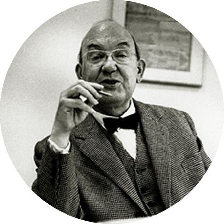
Jan
Tschichold
Typographer &
Author
1902 – 1974
"White Space is
to be regarded
as an active
element, not
a passive
background."
Hold and drag the lines to play with negative & positive space!
About
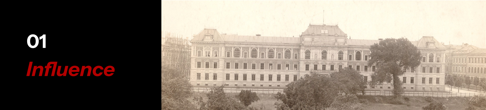
Jan Tschichold was born in Leipzig, Germany in 1902. Tschichold gained an interest in typographical design at an early age as his father's profession was a signage painter. Initially, he dreamed of becoming an artist but his parents deterred him from this to make a career that would give him a more stable income. He eventually graduated from the Leipzig Academy of Graphic Arts and Book Production learning how to be a calligrapher and designer. In 1923, he attended the Bauhaus exhibition at Weimar where he observed works of Modernist design that steered him into his specialization he is remembered by today. The Modern movement in design was just beginning at this point in time, and was unique for rejecting tradition and false rationalism.
Influence & Impact
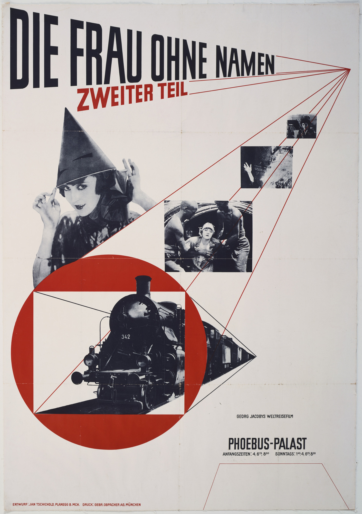
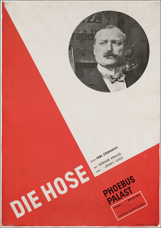
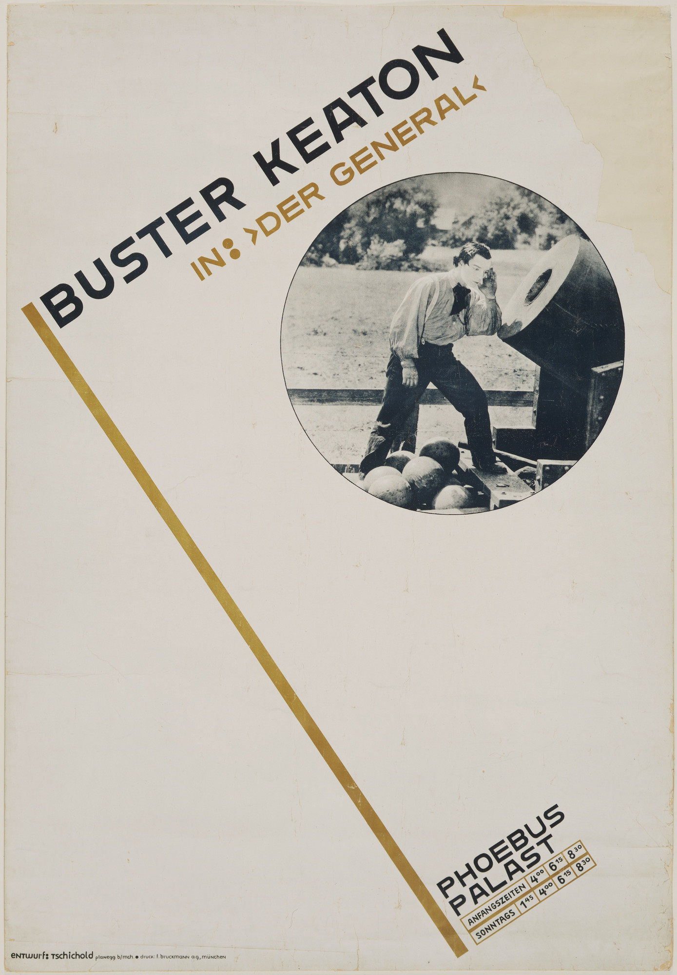
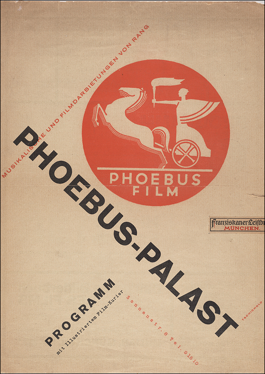
As Modernism emerged throughout Central Europe, so did the New Typography Movement codified by Tschichold. When he was 26 years old he published his first book, Die Neue Typographie (The New Typography) as a designer’s manual with graphic design guidelines on composition, layout, and typefaces that liberate typography from conventional book design. During this period of war, Tschichold was heavily inspired by Constructivism, another avant-garde movement that came from Soviet Russia and the Netherlands. Elements in constructivist propaganda posters such as geometric shapes, photomontages, and limited yet powerful colour palettes are implemented into his own style throughout most of his works. He was a great believer that art and design was a powerful medium to force social change and innovation. As the liberator he was, he loved collecting articles on the newest design developments, trade catalogues,
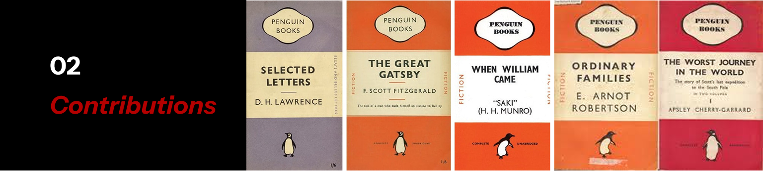
magazine covers and posters from leading designers and anonymous, smaller growing designers. He loved collaborating and learning of other artists’ works so much that included some of his most admired artifacts in his book. It was until 1933 when Tschichold and his wife Edith were both arrested by the Nazis due to his communist beliefs that was promoted through his pieces. After 6 weeks when they were released from prison, he fled the country to Switzerland and England where his aesthetic style became more traditional using key characteristics like symmetrical layouts. This type of design can be identified in his Penguin Book covers published in London. However, his eye for clarity, utility and affordability in design remained the same until the end of his career. His influence stems from his entire journey as a typographer—practice, network and teaching assistance to fellow peers.
For many other reasons, as Tschichold's most significant contribution to the field of typography was introducing the process of The New Typography. This change of history led within that changed the thought and design industry of printing and design into what we know today as publishing. His contribution in functionality of readability in an attempt to communicate that this change in design hierarchy was revolutionary for the concept for Macin type.
Penguin Books
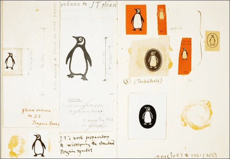
Tschichold worked at Penguin Books from 1947 to 1949, and within the 3 years he was able to make influential remarks that continue to be reminisced in Penguin's branding today. He redrew the original Penguin logo designed by Edward Young, which was kept until 2003 before Pentagram Design took over. Moreover, he curated a cohesive design system for numerous books that allowed the company to successfully mass-produce, market, and sell across Europe. It began with fixing the relationship
between the front cover, spine, and back cover along with standardizing key placements of elements and text. He did this by the use of negative space and proportions which improved the overall feeling and look, making it accessible to a variety of viewers. The simplistic feeling that came from a limited colour palette and repeated layout not only accommodated viewers for accessibility but it also helped the company commercialize the books with low cost, allowing them to be inexpensive to the public. Most importantly, Tschichold's new designs for Penguin created distinction unlike anything before, allowing customers to recognize the brand's identity from just a far.
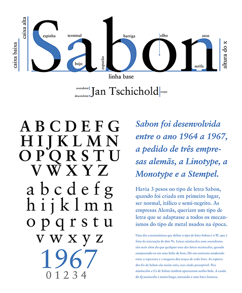
Sabon Typeface
After his experience at large Acubres, Tschichold was instructed the ready elements was made on a components that was considered to create as a typographical creation. As a part of the contribution of Tschichold published the notable Sabon edition that was released in 1967.
The name "Sabon" was suggested by Stanley Morison, the typographer of Monotype. This was initially designed as a commission requested by a German Type Foundry that was looking for a cross-platform typeface. Key characteristics of Sabon is its equal spacing in both roman and italic, as well as its original weight options; normal, italic, and semibold. It is largely influenced by a Garamond interpretation and specifically narrower than Monotype Garamond which reduced printing costs. In addition to the German printers, the anatomy of Sabon allowed it to be printed simultaneously across three types of print: single-type composition, foundry type for hand composition and linecasting. Linotype was known for forcing letterforms to look narrower because it did not allow kerning, whereas monotype limited design freedom due to its strict width system. Sabon is considered an example of Tschichold's later conservative work when he slowly reduced his style from New Typography. The classification of Sabon is an old-style serif, often used as body text in literature and religious notes for optimal legibility.